
What Therapists Should Look for in a Squarespace Template

Choosing a Squarespace template for your therapy practice can be surprisingly difficult.
Not because there aren't enough options. There are hundreds of excellent Squarespace templates for therapists, at various different price points.
The problem is that many therapists may not really know what they're supposed to be looking at when they’re trying to choose.
You open a template and it’s preloaded with colors, fonts, photographs, logo, and copy. Maybe the template feels too corporate. Too feminine. Too bold. Too generic. Or maybe you simply can't imagine your practice looking anything like it.
But most of what you're looking at isn't actually the template.
A well-designed Squarespace template isn't a finished website that you personalize by swapping in your name and photo. It's a starting point for building your website.
The colors can change. The fonts can change. The images can change. Sections can be moved, removed, or added. Buttons can change shape. Background images can be added. The organization of your main navigation can change. The entire layout can be modified.
So when you're choosing a template, you need to learn to look past the superficial design elements and see the structure underneath it.
What Exactly Is a Squarespace Template?
If you're using Squarespace 7.1, the word template can actually be a little misleading.
You're not choosing a rigid design that permanently determines where your photograph goes, what your homepage looks like, or how your service pages have to be arranged.
Think of a template as a thoughtfully designed starting point.
It gives you a framework so you don't have to begin with a completely blank screen. But almost everything you see can be customized.
For example, this is the basic layout for the hero section (meaning the top, “above the fold” portion) of the Lumière Template, my signature design template at Clinique Digital Consulting:
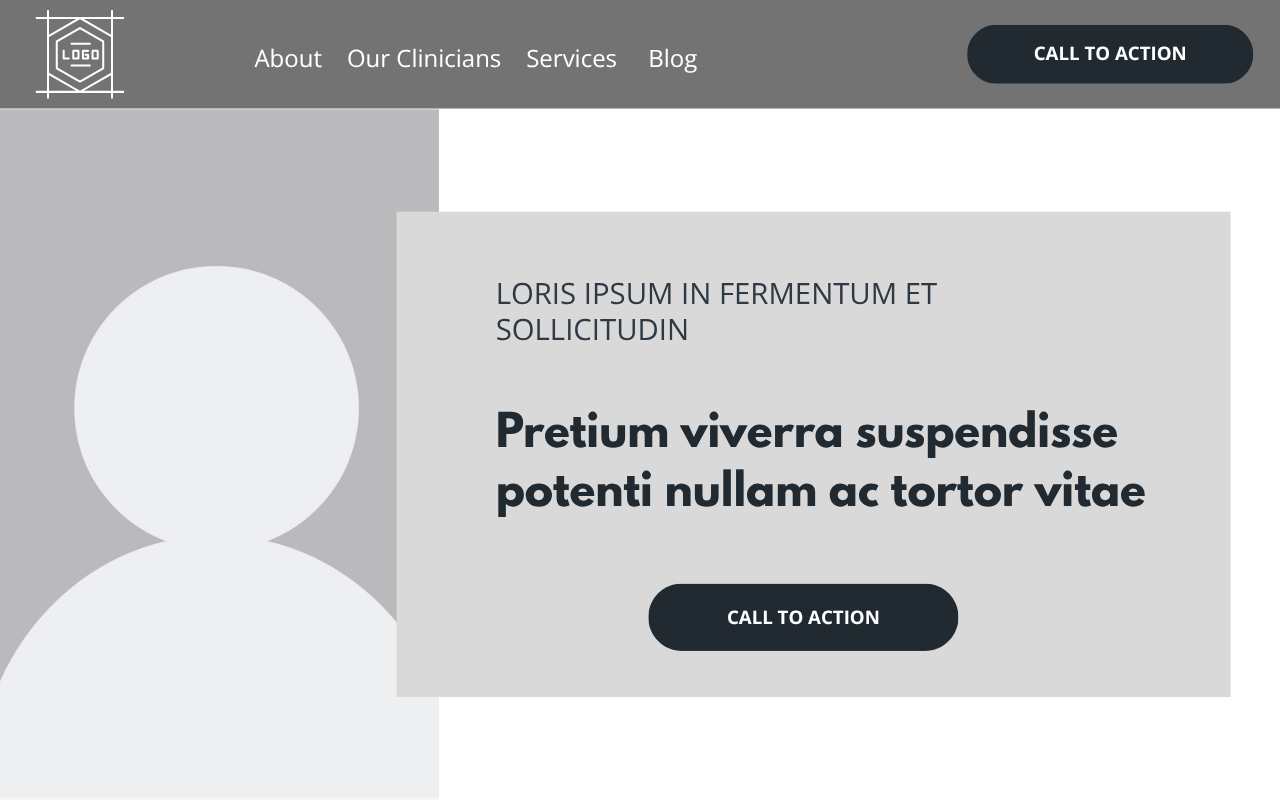
And this grayed-out rendering is roughly what I want my website clients to see when they're evaluating it.
Ignore the placeholder logo. Ignore the gray. Ignore the generic photograph. Ignore the fonts and button style.
Instead, notice the underlying composition:
an uncluttered navigation bar with the site's most important pages and a prominent call to action
a large image area that can immediately establish personality and tone
a clear place to tell visitors what services you provide and where you provide them
a prominent headline
an obvious next step
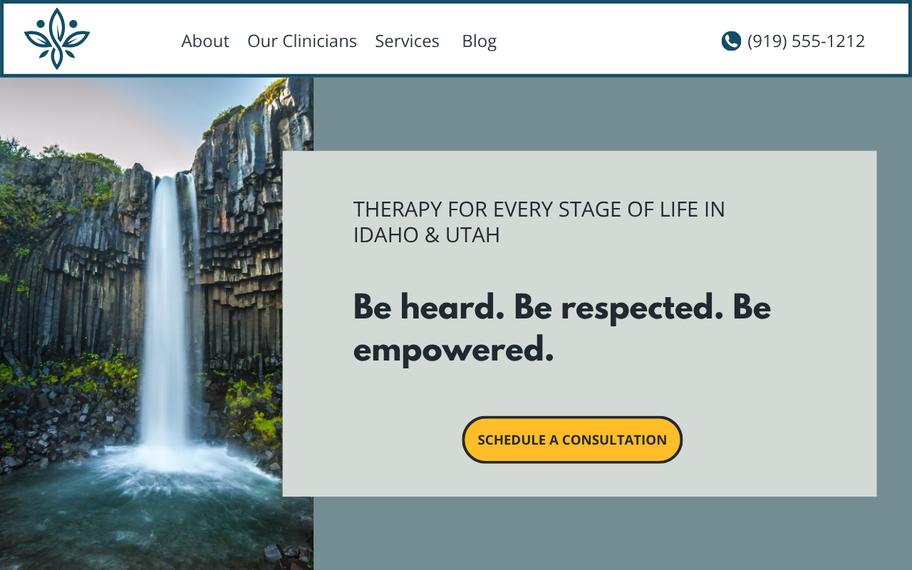
Now look at what can happen when that same basic starting structure is customized for different therapy practices:

Lumière Version 1
Lumière Version 2
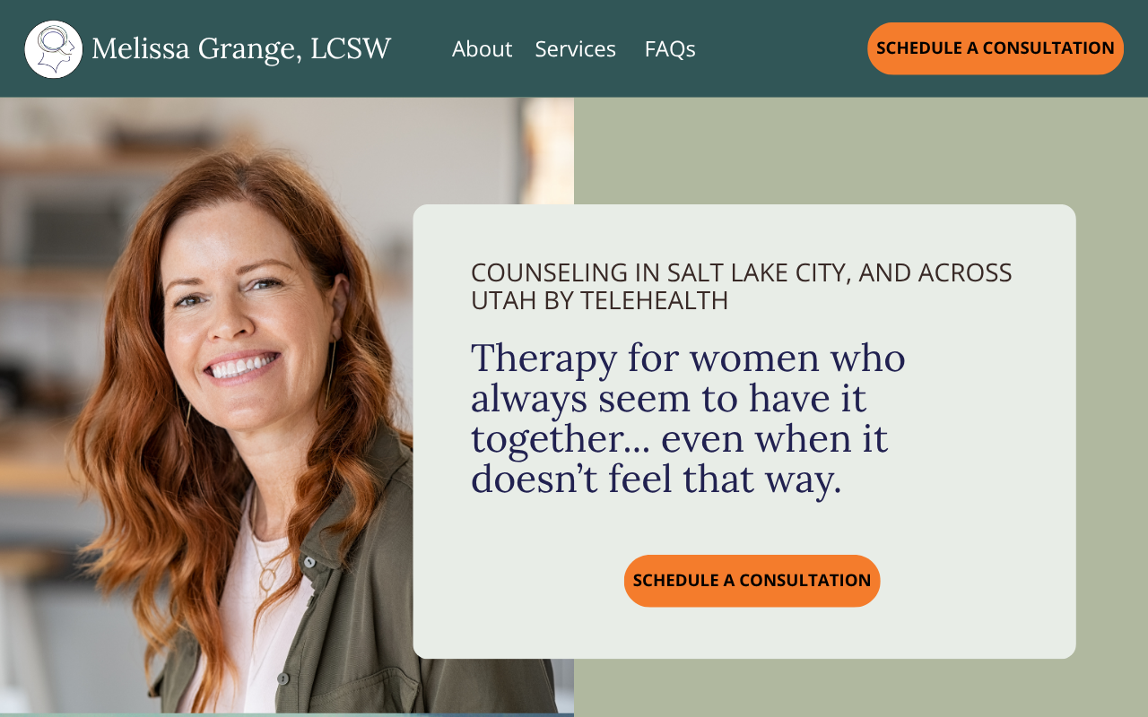
Lumière Version 3
They don't look like the same website. There are elements that are present in some, and not in others. The size of images changes, and elements can be rounded or squared.
Different photography, typography, colors, logos, messaging, button styles, spacing, and other design decisions give each one its own identity.
That's the point.
Don't choose a template because you want your website to look like the demo. Choose it because the underlying structure gives you a strong place to start.
A Good Template Does Three Important Jobs
For a therapist website, I think a good template should accomplish three things.
1. It gives you a starting point
Building a website from a completely blank page sounds like maximum creative freedom.
In practice, it means making hundreds of design decisions from scratch.
How wide should the text be? Where should the image go? How much space should there be between sections? Where should the call-to-action button appear? What comes after the hero section? How should a service page be organized?
A strong template answers many of those questions for you.
That doesn't mean you're stuck with those answers. It means you're starting with a coherent design system rather than reinventing the wheel.
If you’re reading this article, most likely your expertise is therapy—not web design. You shouldn't need to become an expert in visual hierarchy, spacing, typography, conversion rate optimization, and user experience just to decide what belongs on your homepage.
A template gives you something good to react to and refine.
2. It creates visual consistency—and consistency builds trust
People notice when a website feels professional, even if they can't explain exactly why.
They also notice when something feels off.
Imagine clicking from a therapist's homepage to an About page that suddenly looks like it belongs to another website. The typography changes. The spacing feels different. Buttons are in different places. One page is polished and spacious while another is crowded and difficult to scan.
You may not consciously think, This website lacks a consistent design system.
You just experience a little friction.
That's particularly important for a therapy website.
A prospective client is being asked to trust you with something personal. Your website is often one of their first experiences of your practice, and visual consistency helps communicate that the practice itself is thoughtful, established, and professionally run.
A well-designed template provides that consistency across the site.
Headings follow a hierarchy. Sections relate visually to one another. Buttons behave consistently. Pages feel like parts of the same whole.
And because the template establishes those rules from the beginning, you don't have to redesign the website every time you add a new page.
3. It helps determine what information belongs where
This is the part therapists are most likely to overlook.
A good therapy website template doesn't just tell you where things look good.
It gives you prompts for what you need to say, and where you need to say it.
That’s important, because prospective clients don't arrive at your website in the same place psychologically.
Some people are still trying to understand what they're experiencing. They may be searching Google with a question.
Others already know they want therapy and are comparing therapists.
Someone else may have heard your name from a physician, friend, attorney, or another therapist and be looking specifically for you.
And someone who has already spent time on your website may simply be looking for the button that lets them schedule.
Those visitors have different search intent, but there's also a larger journey taking place.
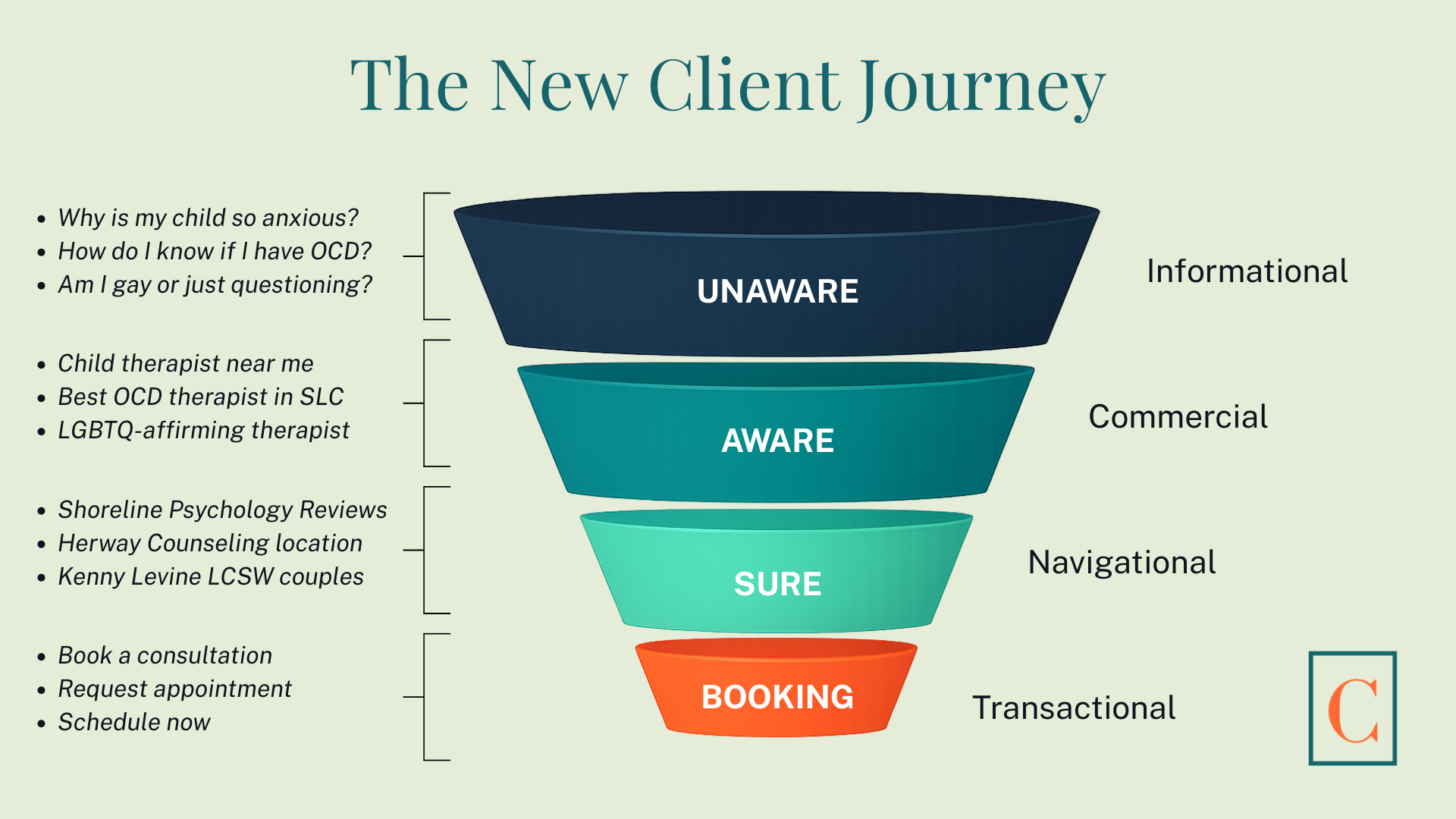
The new client journey
A prospective client moves from being unaware of you, to aware of you, to sure enough about you to take the next step, and finally to booking.
Your website should speak to clients wherever they are in this client journey, and help facilitate their movement to the next step.
A Good Template Is Built Around How Clients Choose a Therapist
This is one of the biggest differences between a generic Squarespace template and a template designed specifically for therapists.
A generic template may look attractive. But it may have been designed for a photographer, consultant, restaurant, interior designer, or online store.
The placeholder sections reflect the needs of that business.
A well-designed therapist template should reflect the questions prospective therapy clients actually need answered.
For example:
Am I in the right place?
The top of the page should quickly help visitors understand who you work with, what you help with, and where your services are available.
Does this therapist understand what I'm dealing with?
The copy should demonstrate an understanding of the visitor's concerns without forcing them to hunt through the site.
What does this therapist offer?
The website should make your services easy to understand and give visitors clear paths to the pages most relevant to them.
Why should I choose this therapist?
Training, experience, approach, credentials, and other trust-building information should appear where it helps the visitor make a decision—not simply because there happened to be an empty box in the template.
What would working with this person actually be like?
Your website should give prospective clients some sense of you and your approach before asking them to contact you.
What do I do next?
Calls to action should be easy to find throughout the website. Once someone decides they're ready, don't make them search for a way to contact you.
This is why I prefer starting with a template designed specifically for therapy practices.
The template isn't writing your website for you. It's creating a strategic framework for the copy.
What You Should Look at When Choosing a Squarespace Template
Once you stop focusing on the demo's colors and photographs, you can evaluate the things that actually matter.
Look at the overall page structure. Is there a clear visual hierarchy, or does everything compete for attention?
Look at the navigation. Can visitors easily understand where to go?
Look at the hero section. Is there enough space for a clear message about the practice and an obvious next step?
Look at how service pages are structured. Does the layout support substantive copy, or does it seem designed primarily to showcase photographs?
Look at calls to action. Are there natural opportunities throughout the page to help visitors reach out?
And look at the website as a whole. Do the pages feel as though they belong together?
You're evaluating the architecture and design logic, not the decorations.
A Few of My Favorite Squarespace Templates for Therapists
If you're looking for a more elevated starting point, Walker Strategy Co. makes some of my favorite premium Squarespace templates for therapists.
What I particularly like about these templates is that they aren't simply attractive designs. They're built specifically for mental health practices, which means the pages and sections already anticipate much of the content a therapist website needs.
Here are three of my favorites:
Weld
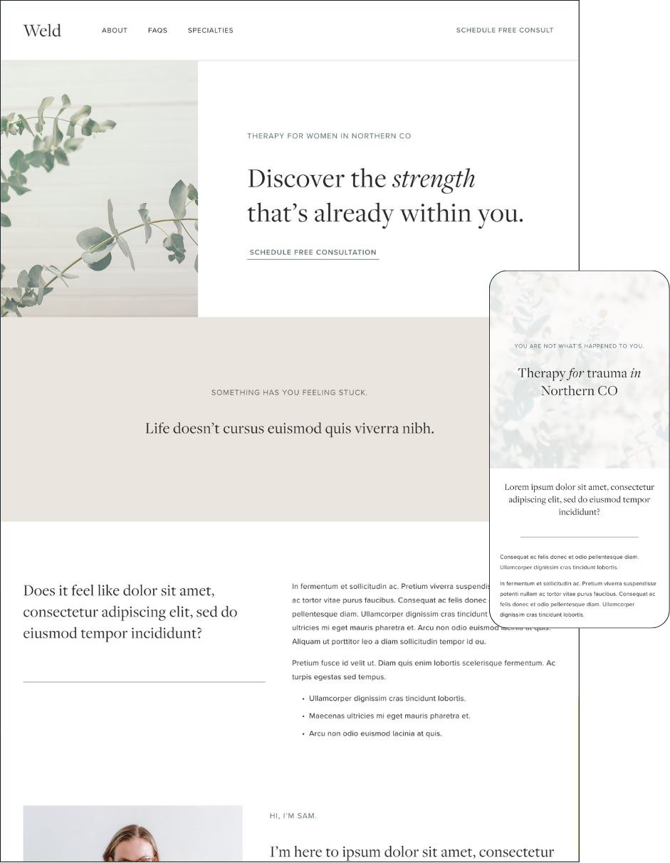
Walker Strategy Co.’s Weld Tempate
Click the image to view the demo and purchase this template.
I love the Weld template so much, it was the starting point for my own private practice website.
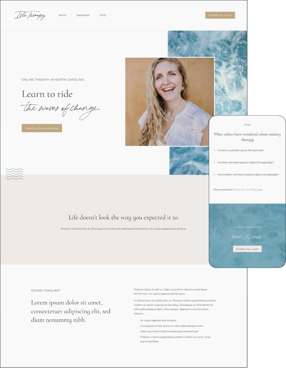
Walker Strategy Co.’s Isle Template
Click the image to view the demo and purchase this template.
This template was used in building the website for Herway Counseling in Salt Lake City, UT. Nicole loves the template’s calming, clean design.
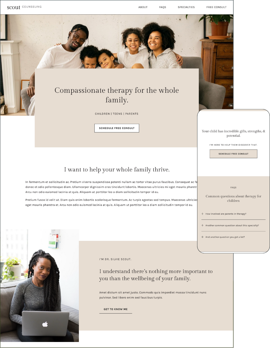
Walker Strategy Co.’s Scout Template
Click the image to view the demo and purchase this template.
Psychiatric Services & Consultation in Durham, NC chose the Scout Template as the starting point for an integrative psychiatry practice. The practice owner, Dr. Patricia Knaudt, loves this templates crisp, inviting feel.
Look at the actual websites that were built from these templates. See how different they look once they are customized. Instead of the superficial design elements, look at how information is organized. Look at the opportunities the template gives you to introduce your services, establish credibility, answer prospective clients' questions, and guide them toward contacting you.
The photography, colors, fonts, copy, and branding are where you make it yours.
Affiliate disclosure: Clinique Digital Consulting is a Walker Strategy Co. affiliate. If you purchase a template through one of the links above, I may earn a commission at no additional cost to you. I recommend these templates because I genuinely think they're strong options for therapy practices.
Choose a Therapist Template, Then Make It Yours
There are plenty of beautiful general-purpose Squarespace templates available.
For a therapy practice, however, I recommend starting with a template built specifically for therapists whenever possible.
A therapist-specific template starts with a better understanding of the job the website needs to do.
It can anticipate the kinds of pages a therapy practice needs. It can provide space for the kinds of copy prospective clients need to read. It can build in opportunities to establish credibility and trust. And it can help create a logical path from first impression to inquiry.
Then comes customization.
That's where the template becomes your website.
Your brand colors replace the demo palette. Your typography changes the personality of the design. Your photography establishes an entirely different emotional tone. Your copy speaks to the people you actually want to reach. Sections are added, removed, moved, or reconfigured based on your practice.
By the time the process is finished, two websites that began with the same template can look and feel remarkably different.
That's exactly how it should work.
Clinique Digital Consulting builds websites for therapists in private practice: sites that get found, convert visitors into consultations, and that you'll know how to manage.
